Designs and explorations that are lost in the ether.


Zocdoc Brand Refresh
Brand refresh for a free online service to help patients find doctors and book appointments.
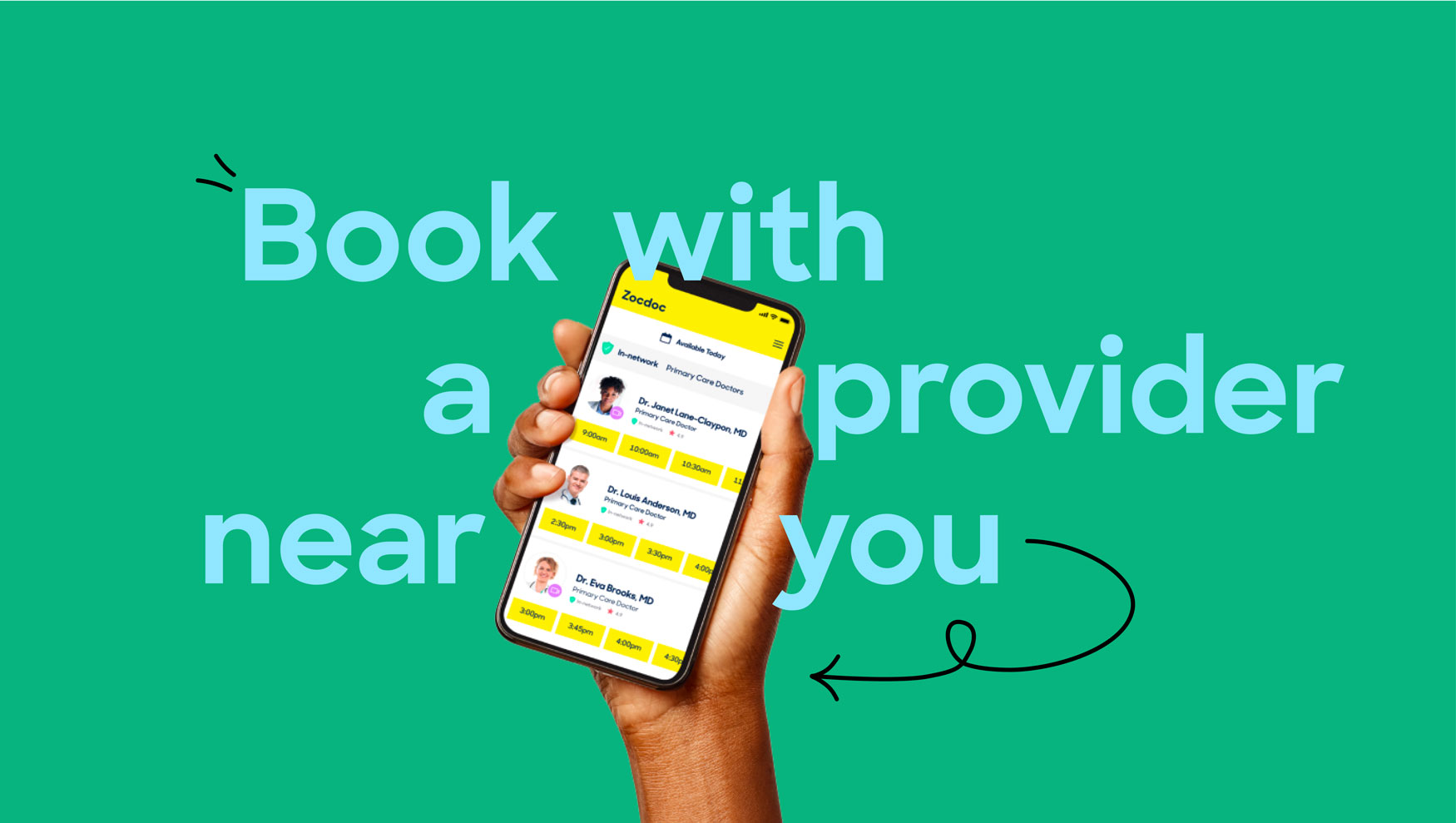
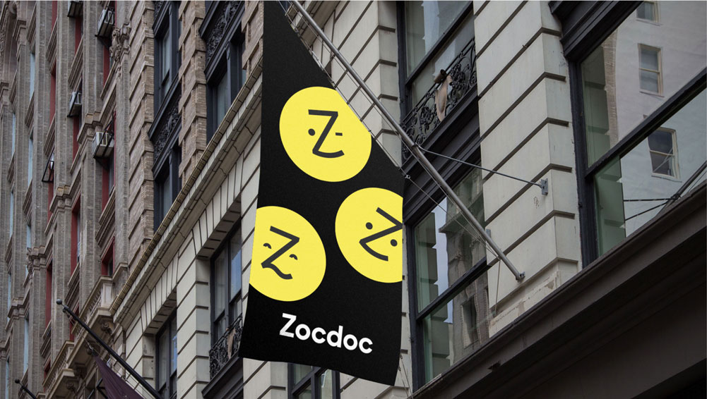
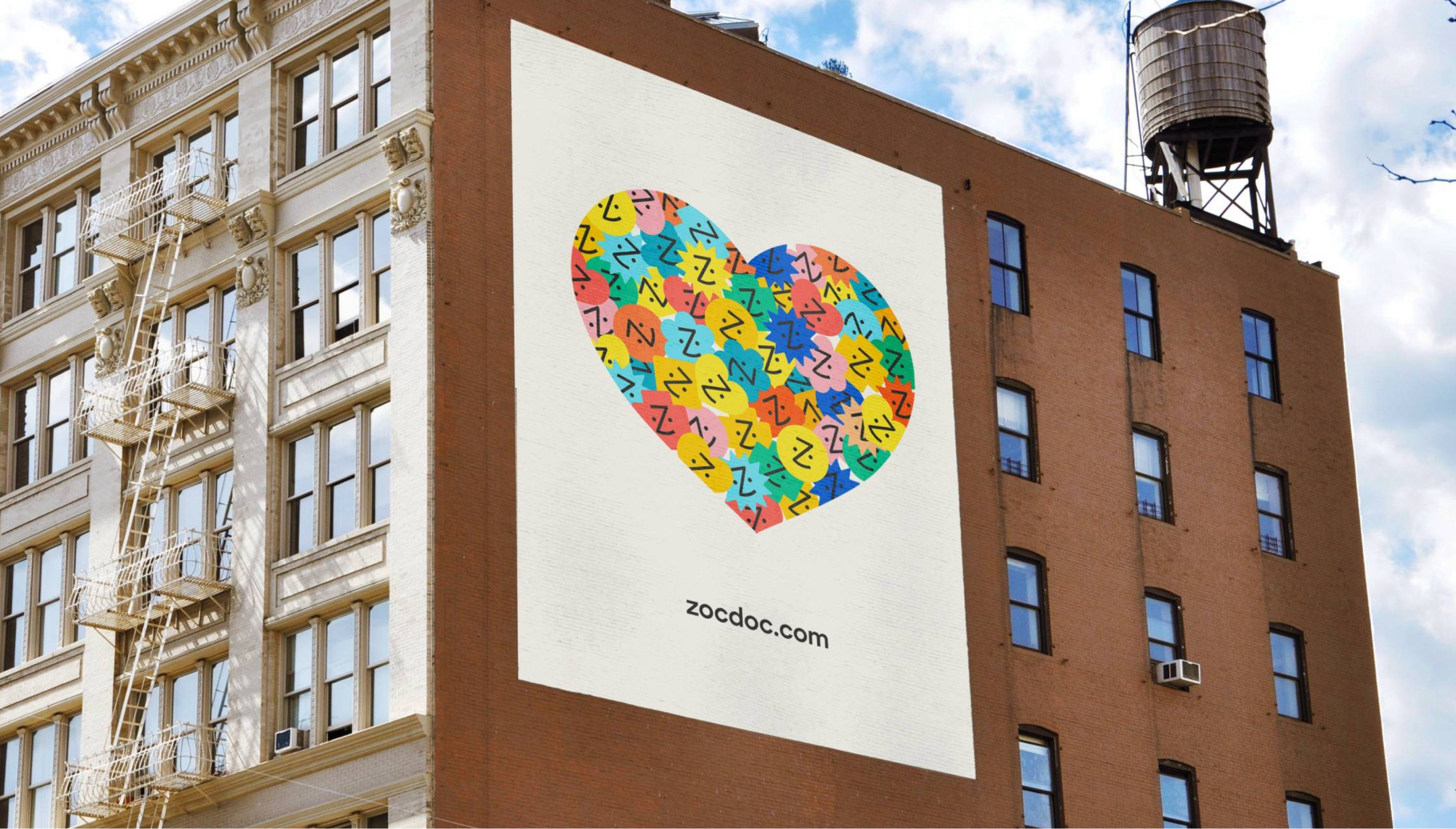
In 2021, Zocdoc's brand studio team embarked on a significant project to refresh and update the patient brand's identity, previously established by Wolf Olins in 2016. This comprehensive refresh initiative lasted for six months and involved extensive research on other healthcare brands and competitors. The objective was to differentiate Zocdoc from the conventional conservatism found in traditional healthcare brands and the trendy millennial vibe often associated with new health tech companies. As a result, we successfully developed a visually compelling language that authentically reflects Zocdoc's unique identity.
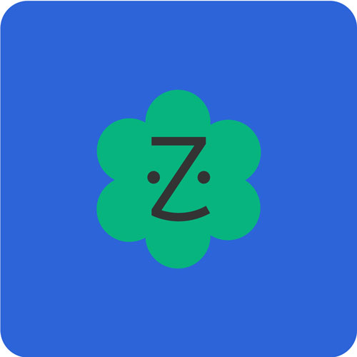
Previous logo
![]()
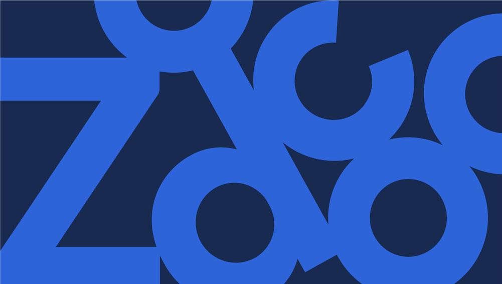
New logo
![]()


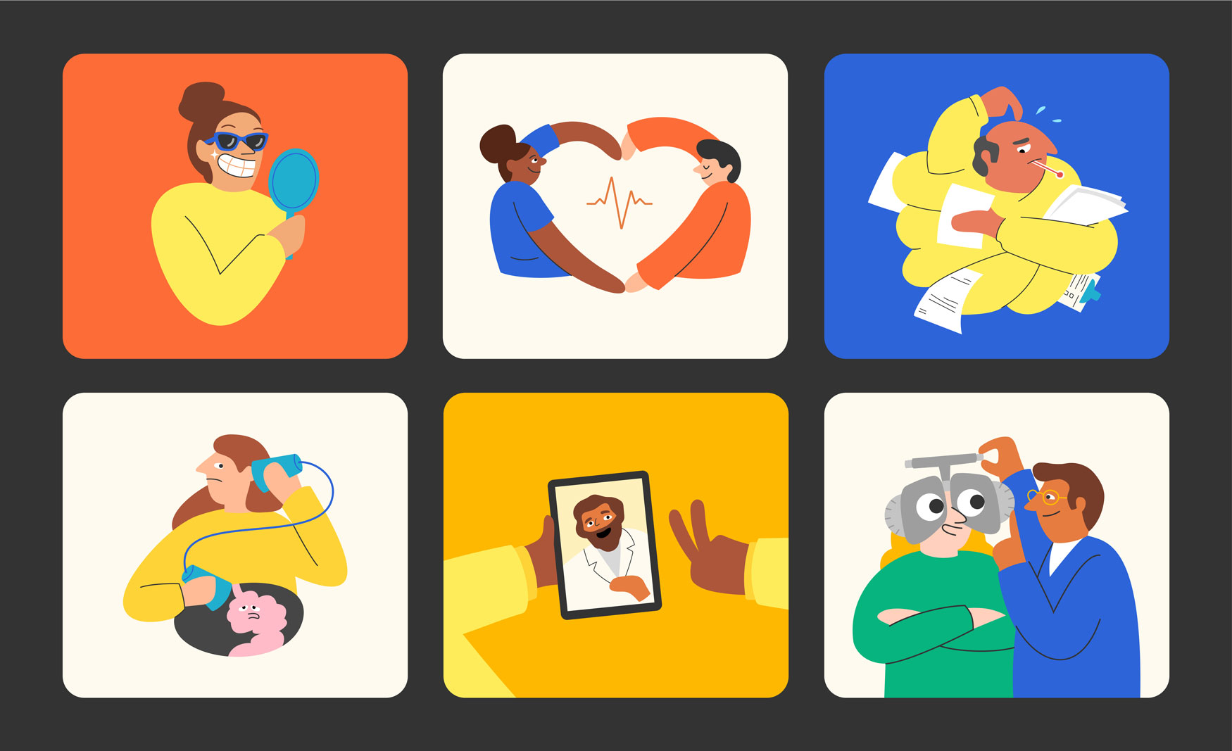
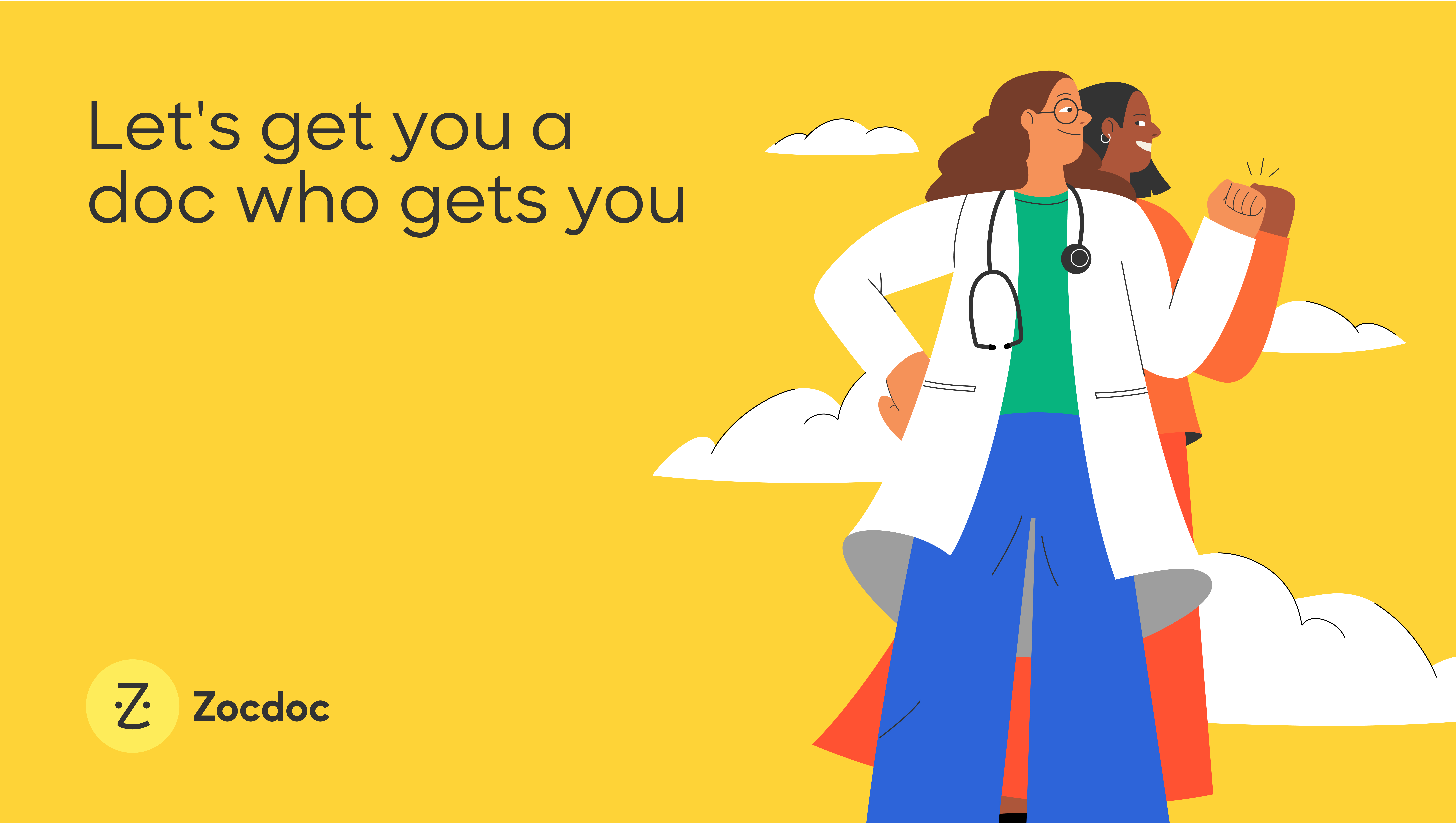


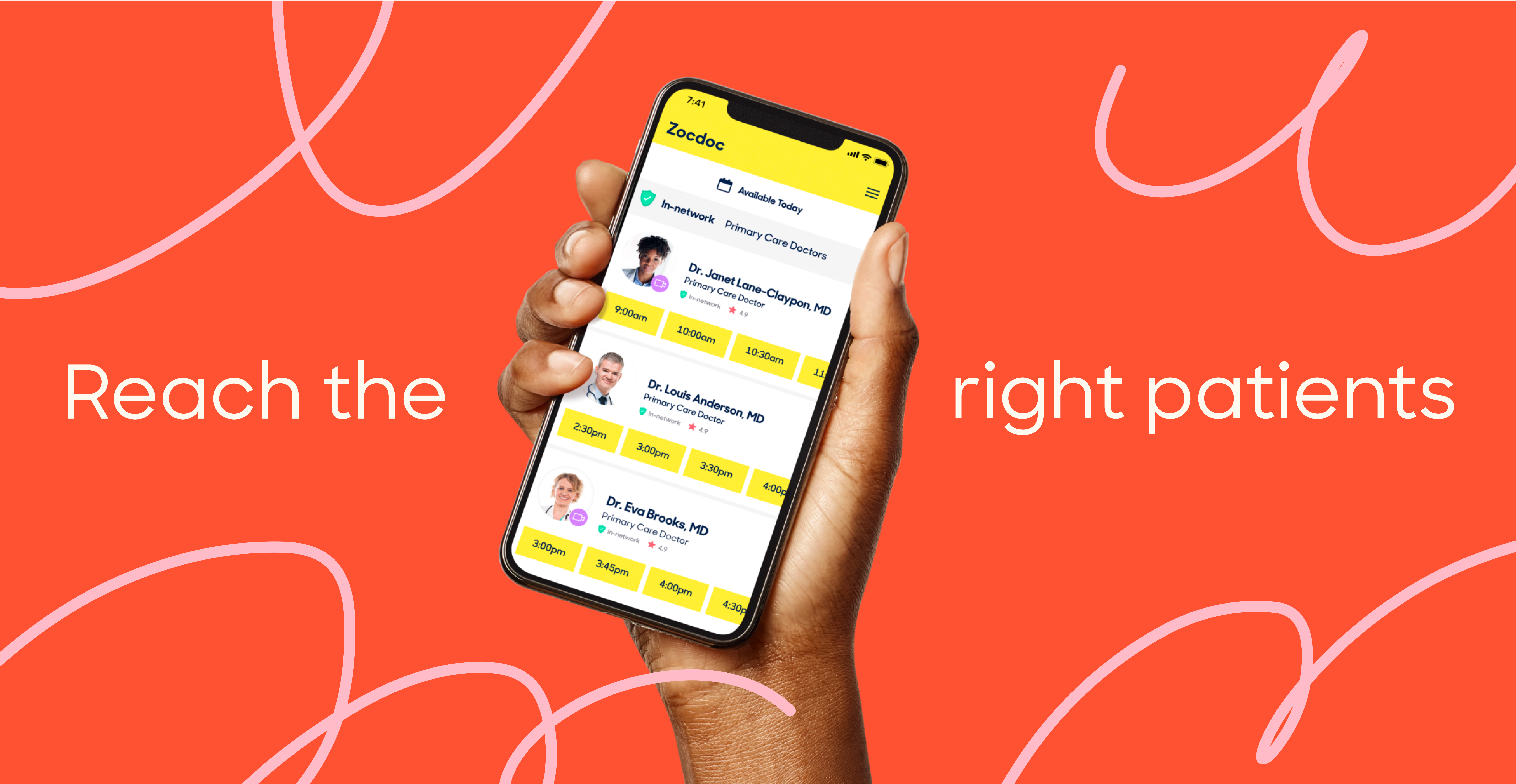
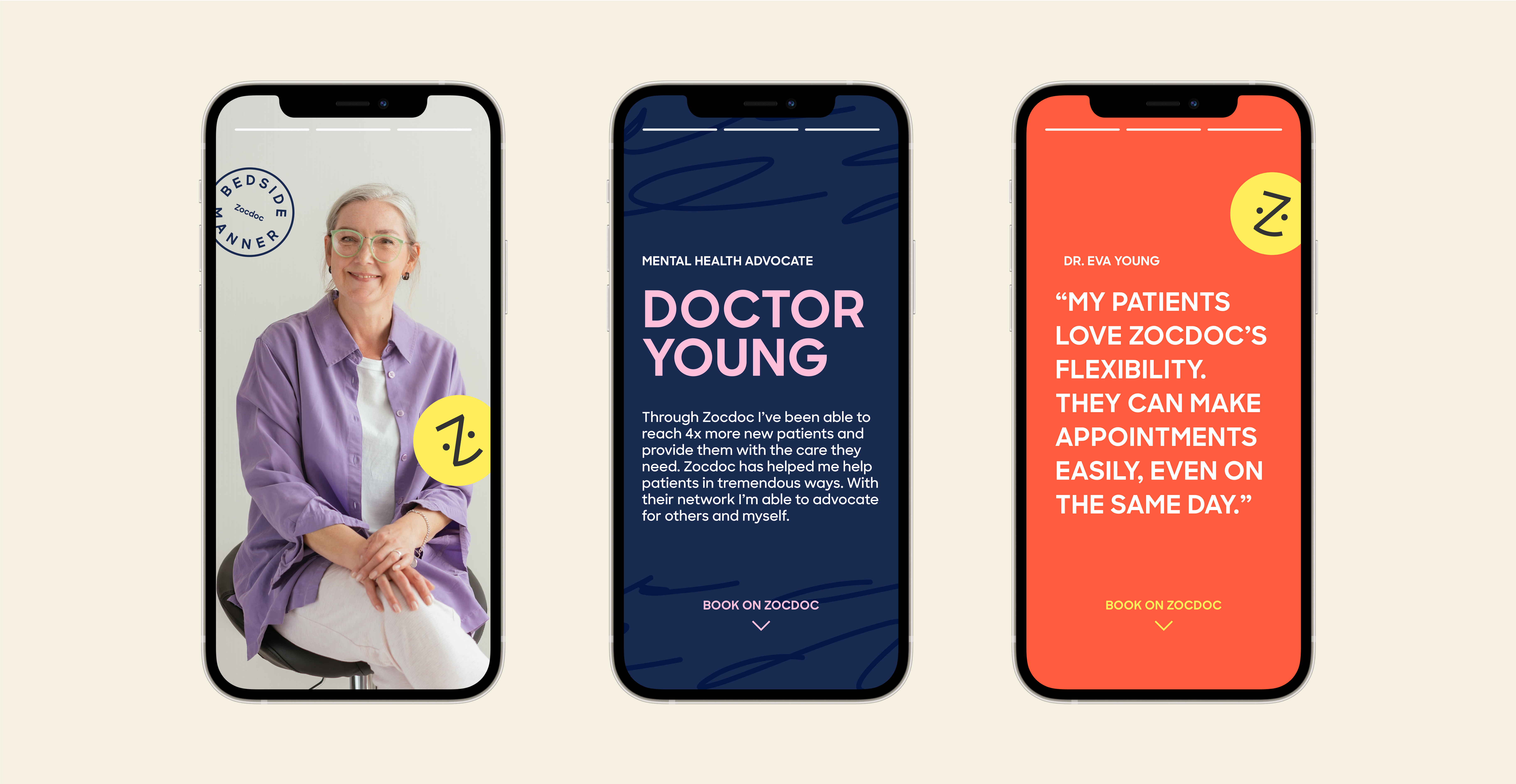
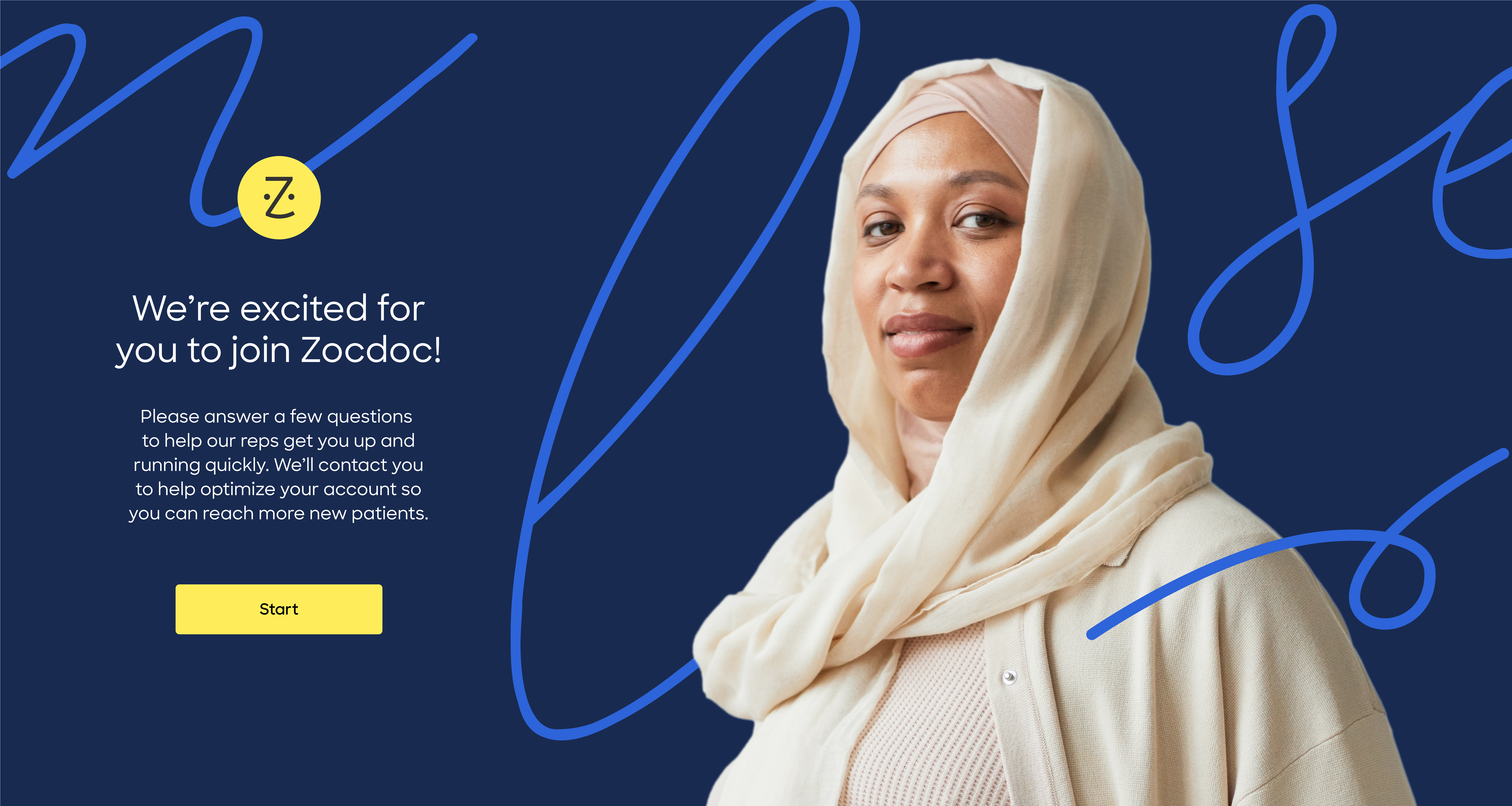
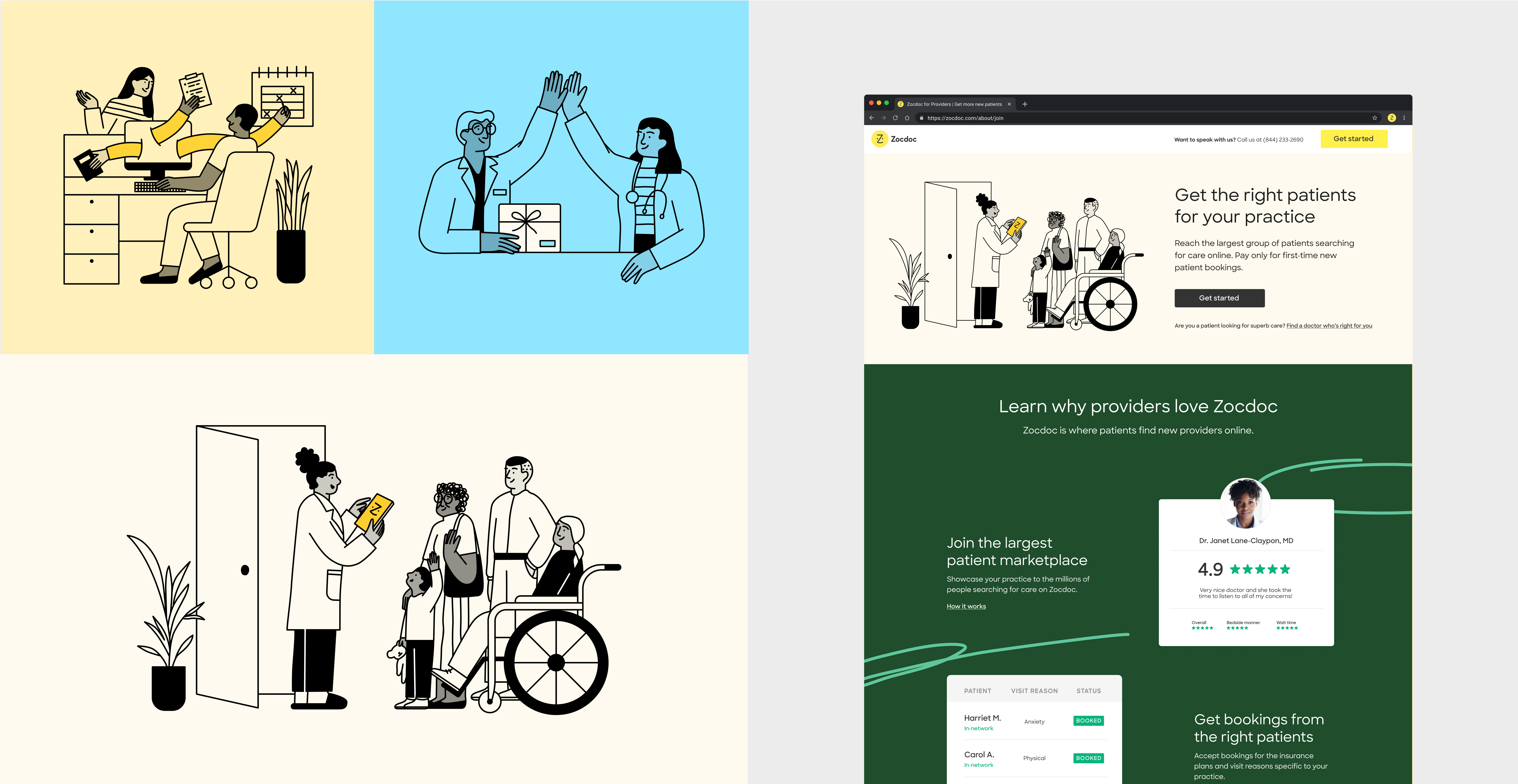
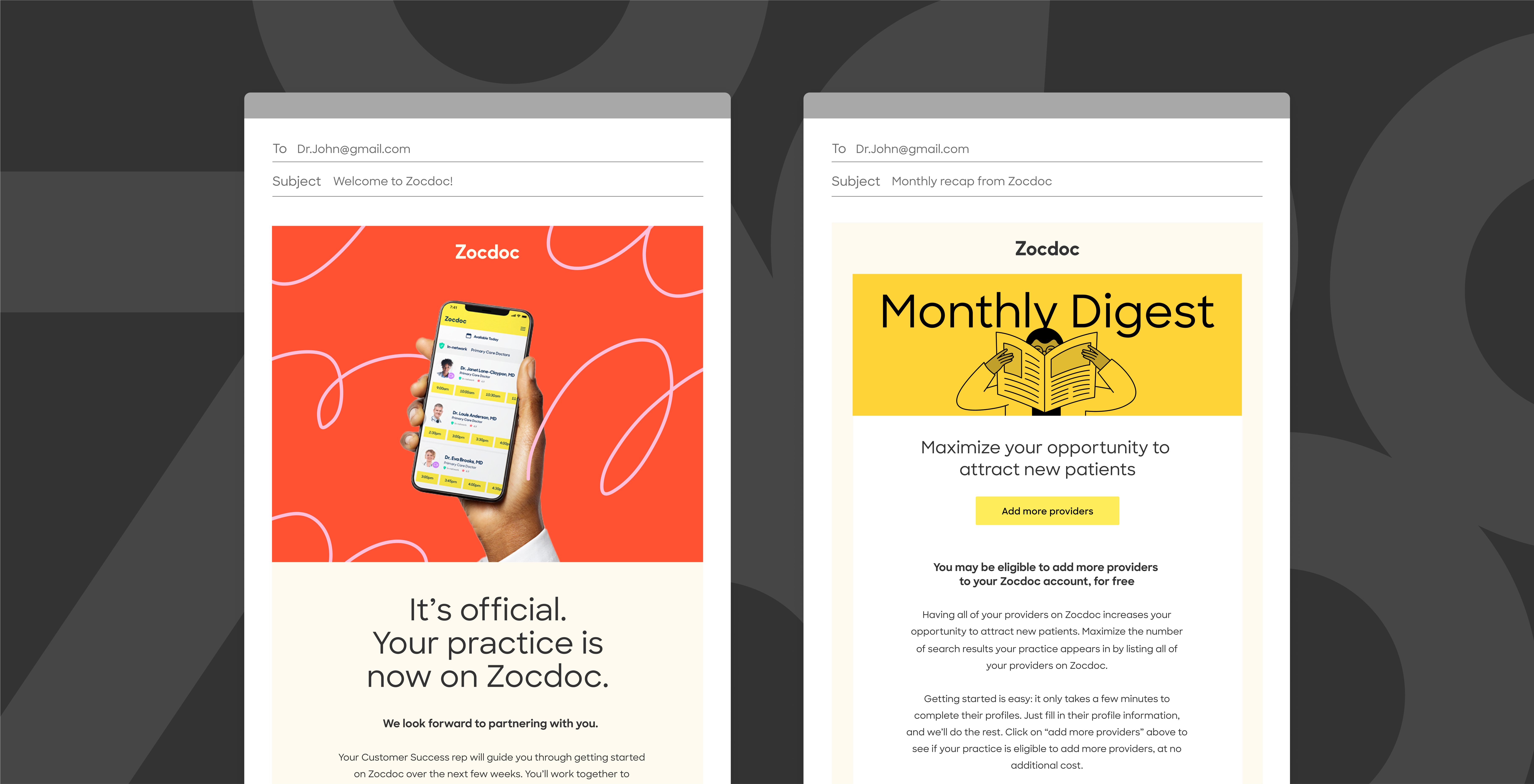
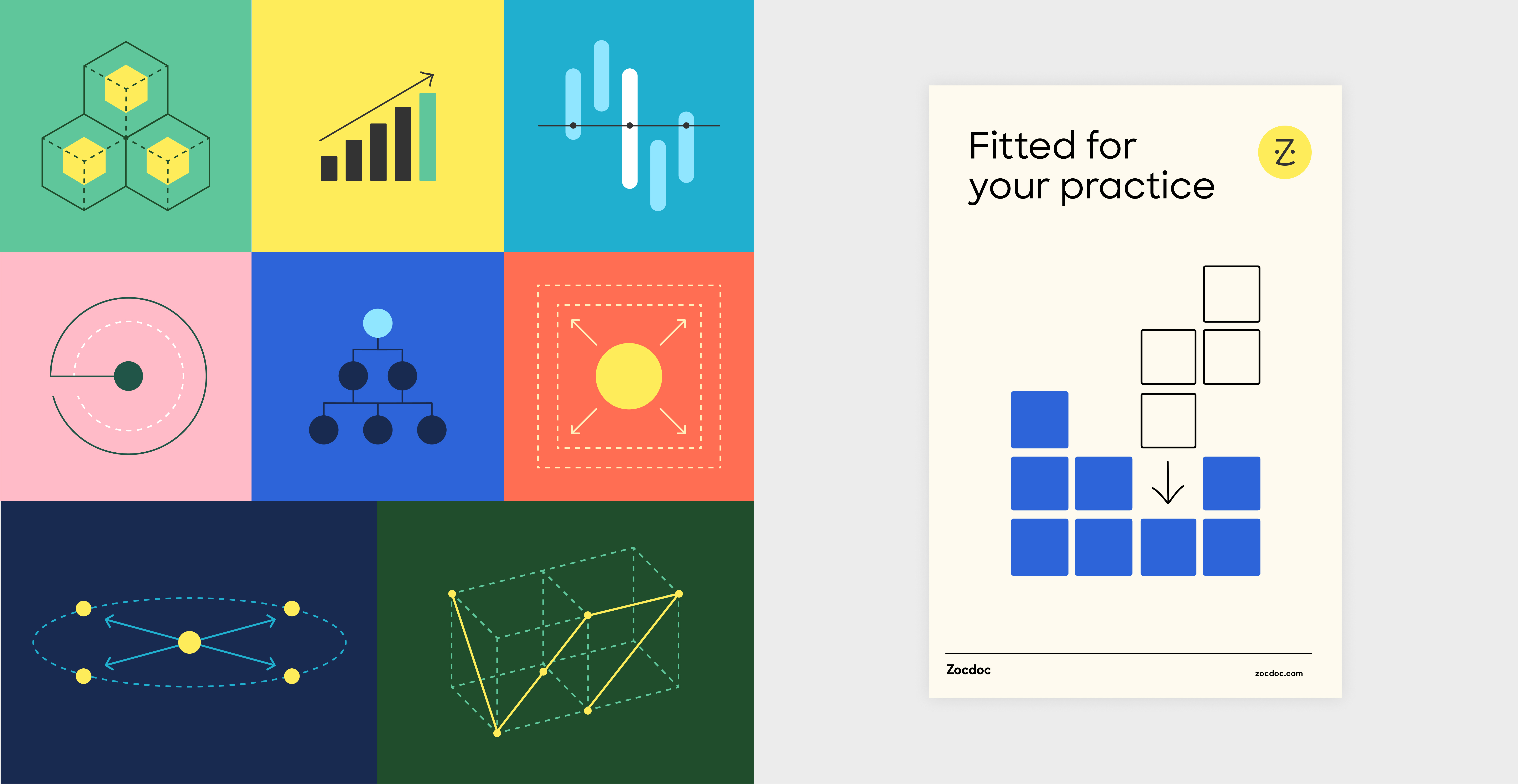
In 2022, our team was tasked with refreshing the provider brand. Building upon the foundations of the successful patient brand refresh, our focus was to highlight the vital aspects for providers, namely quality patients and reputation. Through exploration and reviews, we developed a direction that exudes warmth, approachability, intelligence, and trustworthiness. The refreshed provider brand features optimistic colors, natural photography, and a modern use of space. Light and personal illustration styles with hand-drawn patterns add a human touch. Diagrammatic drawings and infographics were incorporated to enhance the sense of expertise, elevating the overall provider brand.


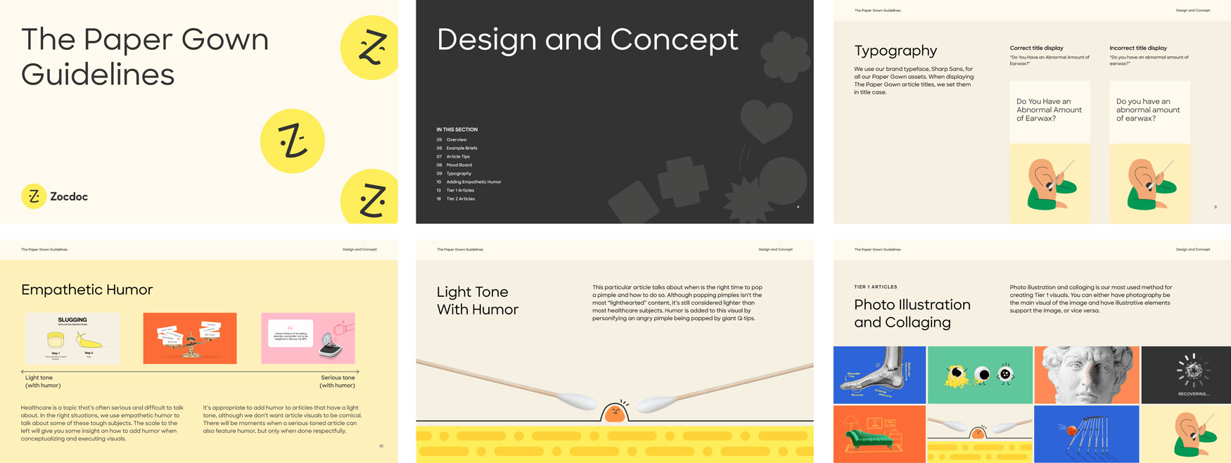
The Paper Gown
Editorial concepts and graphics for Zocdoc stories about healthcare.

“The Paper Gown, a Zocdoc-powered blog, strives to tell stories that help patients feel informed, empowered and understood.”
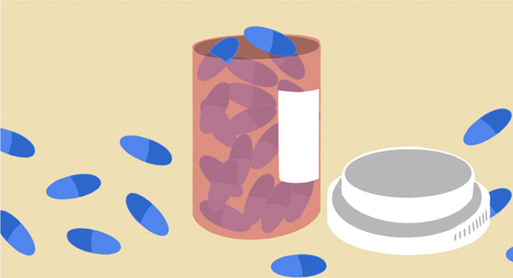
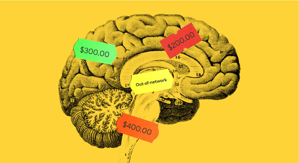
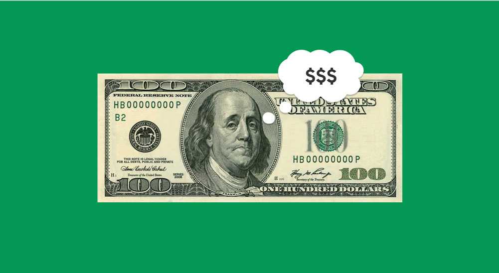
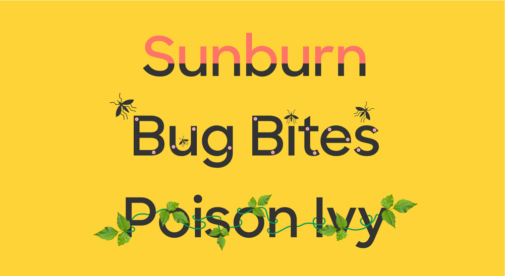
During my involvement in the brand refresh project, I took on several key responsibilities. One of them was focusing on The Paper Gown, which is an essential touchpoint of the patient brand. I undertook the task of visually exploring and crafting the official blog guidelines and mood board that aligned with Zocdoc's cheeky identity. The graphics were given an editorial feel by curating photography and conceptualizing graphics, ensuring they reflected the desired tone. It was important to utilize empathetic humor when appropriate to address sensitive healthcare topics, tapping into the caring nature of the brand.
During my involvement in the brand refresh project, I took on several key responsibilities. One of them was focusing on The Paper Gown, which is an essential touchpoint of the patient brand. I undertook the task of visually exploring and crafting the official blog guidelines and mood board that aligned with Zocdoc's cheeky identity. The graphics were given an editorial feel by curating photography and conceptualizing graphics, ensuring they reflected the desired tone. It was important to utilize empathetic humor when appropriate to address sensitive healthcare topics, tapping into the caring nature of the brand.
Previous visuals


New visuals
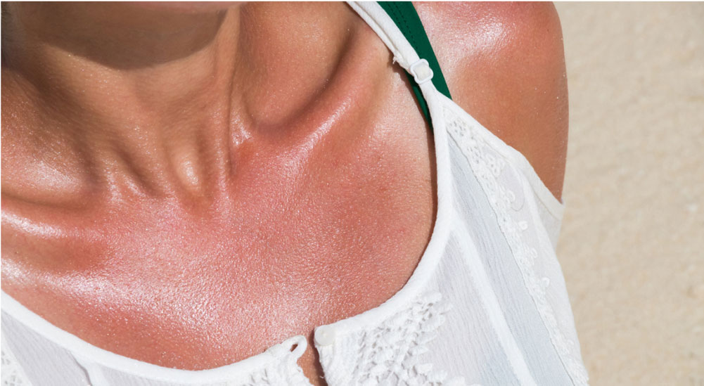

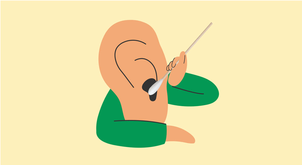
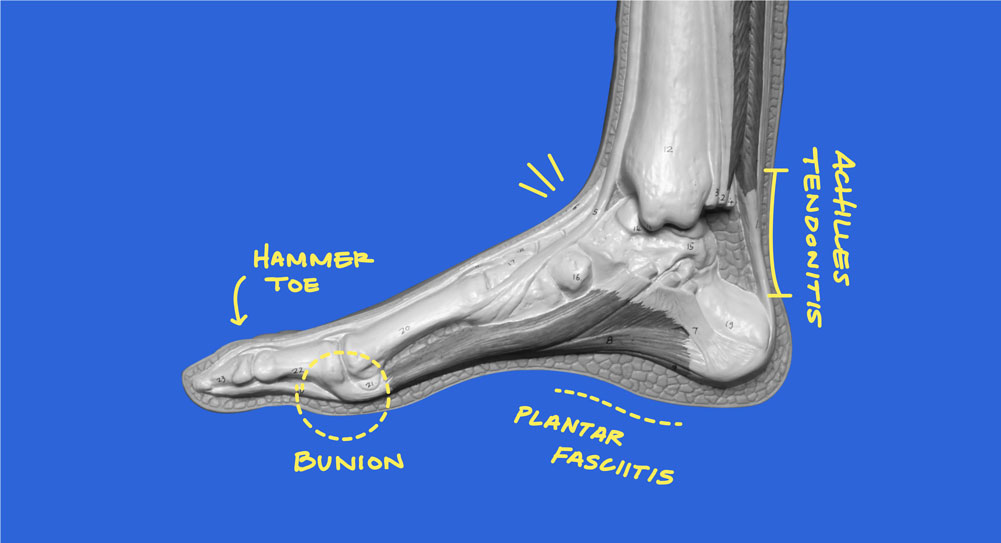
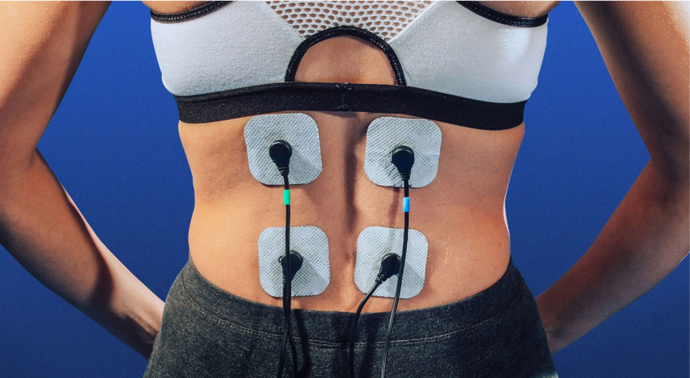


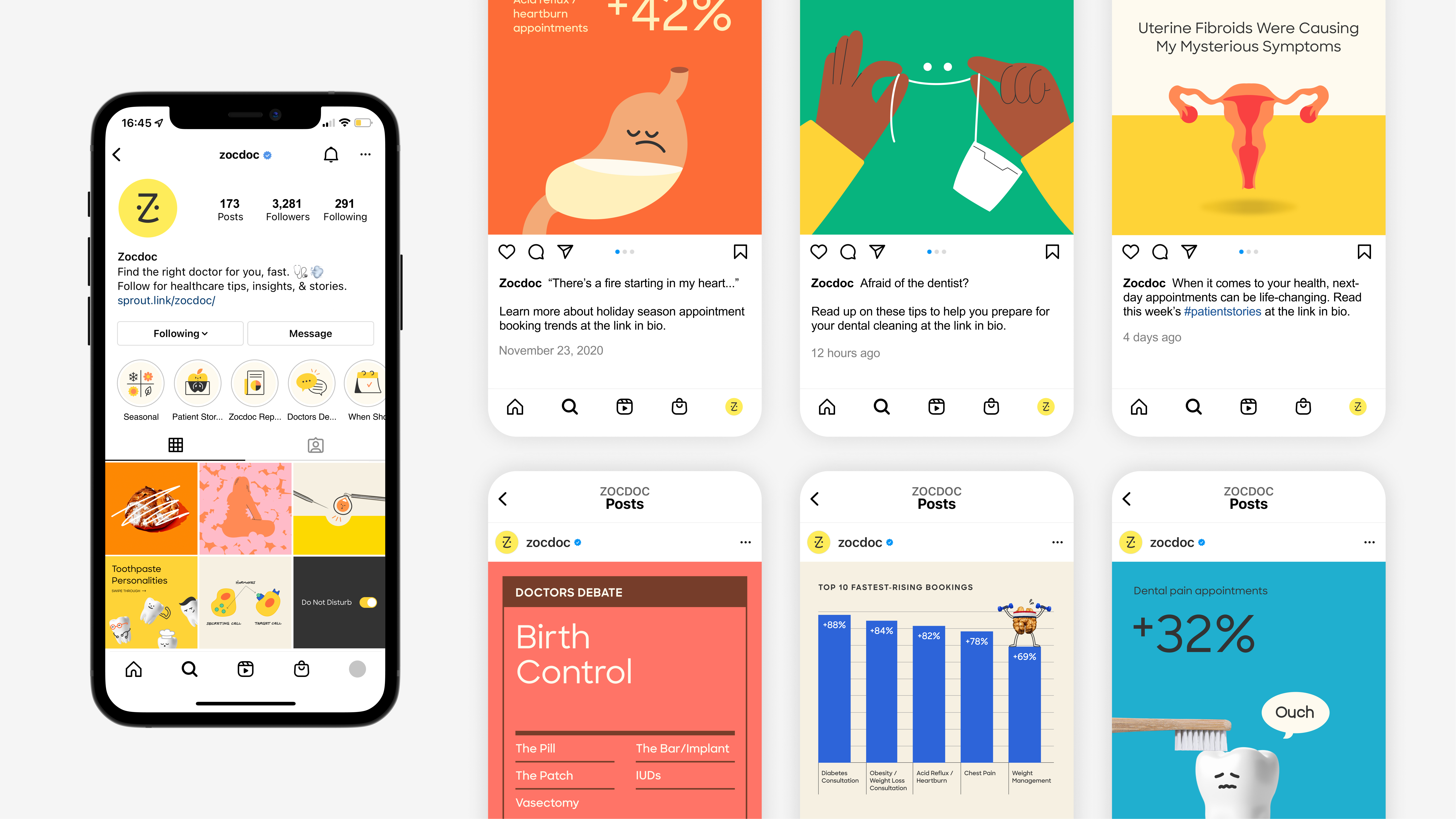
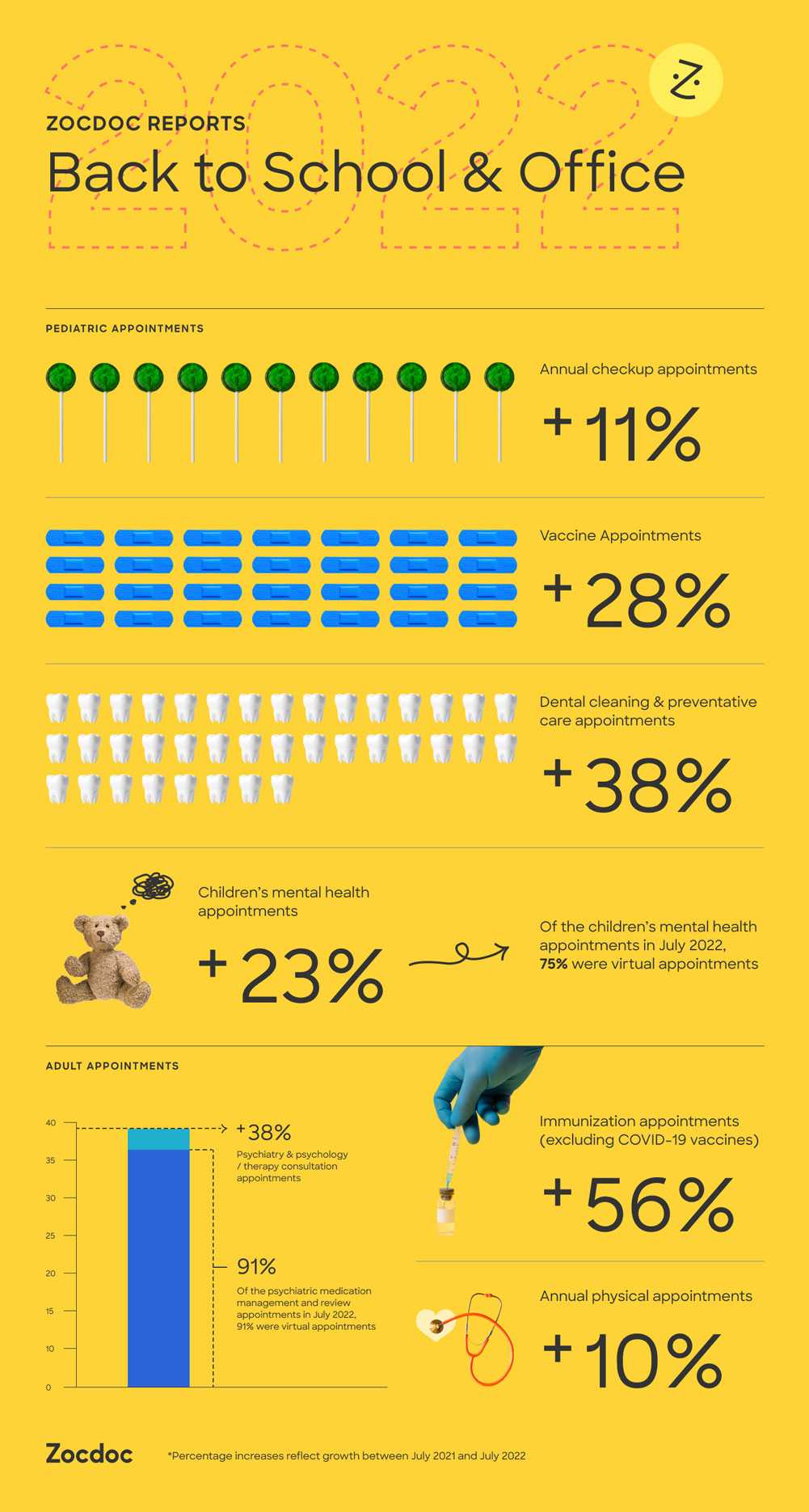
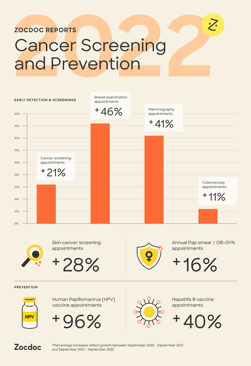
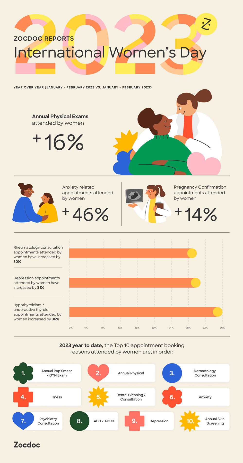
Zocdoc Reports (data reports)


Visual Guidelines
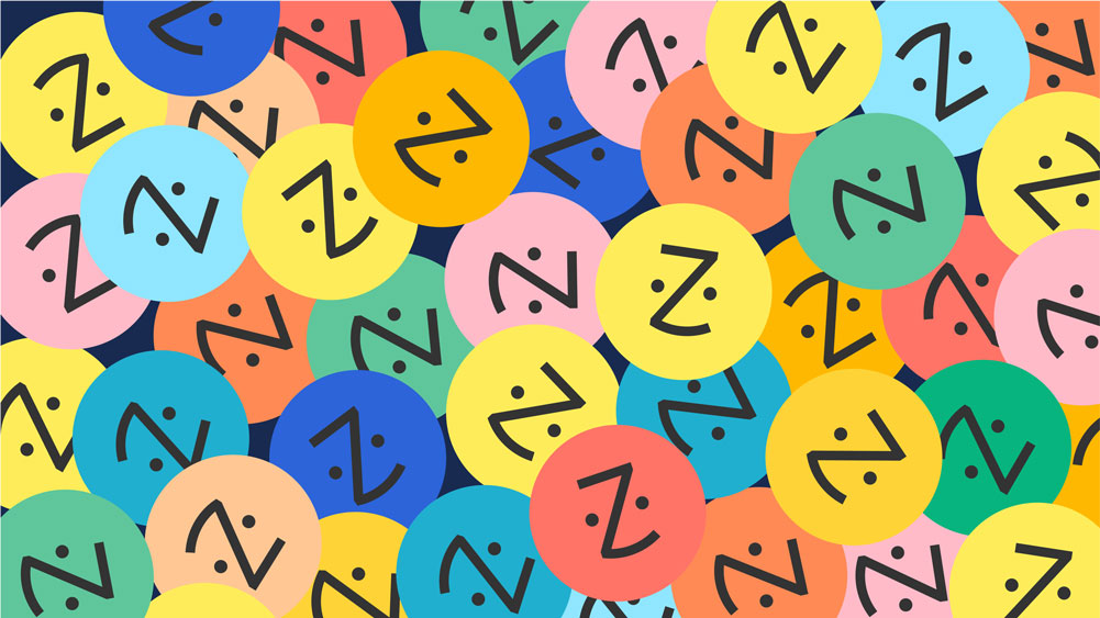
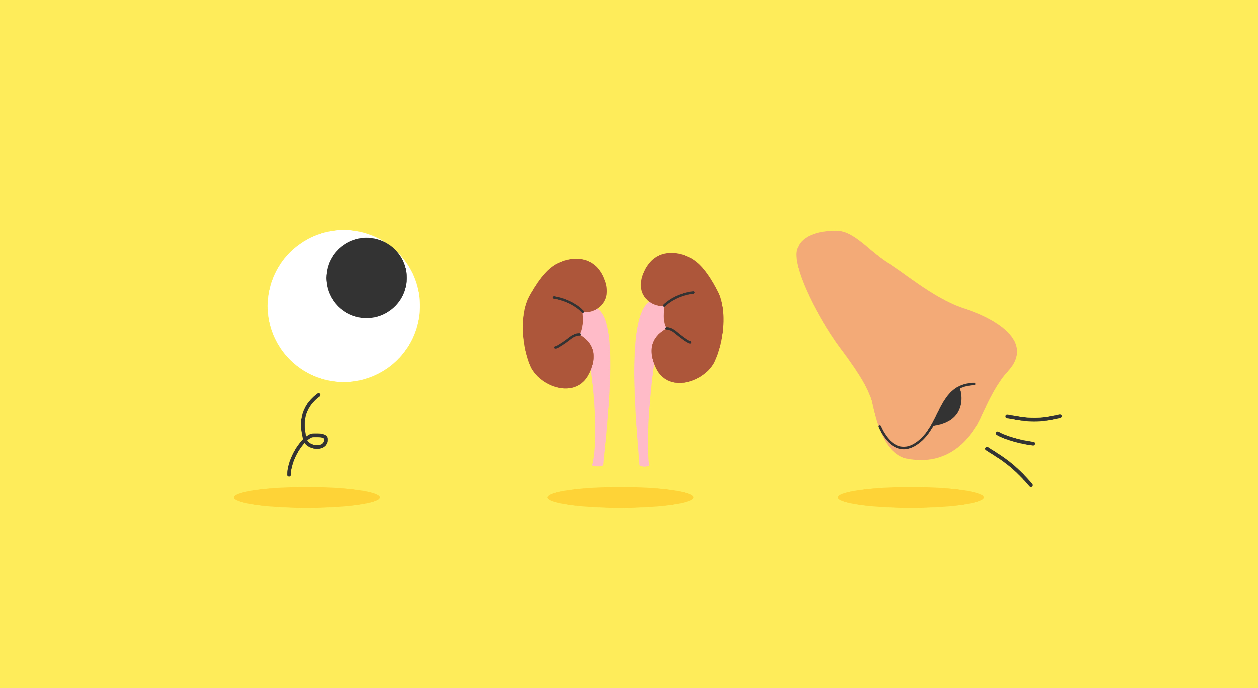
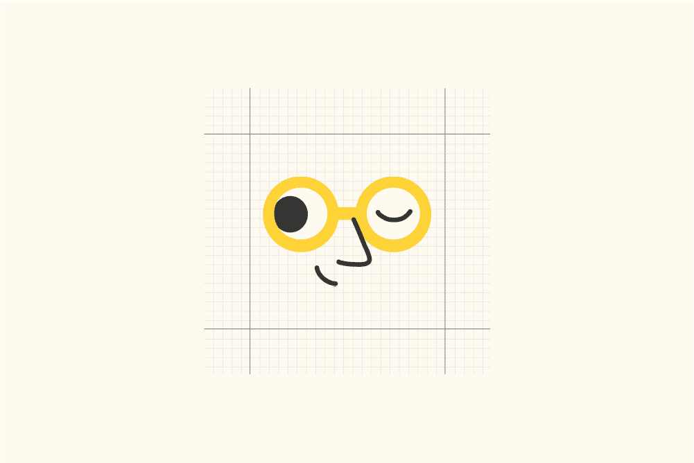
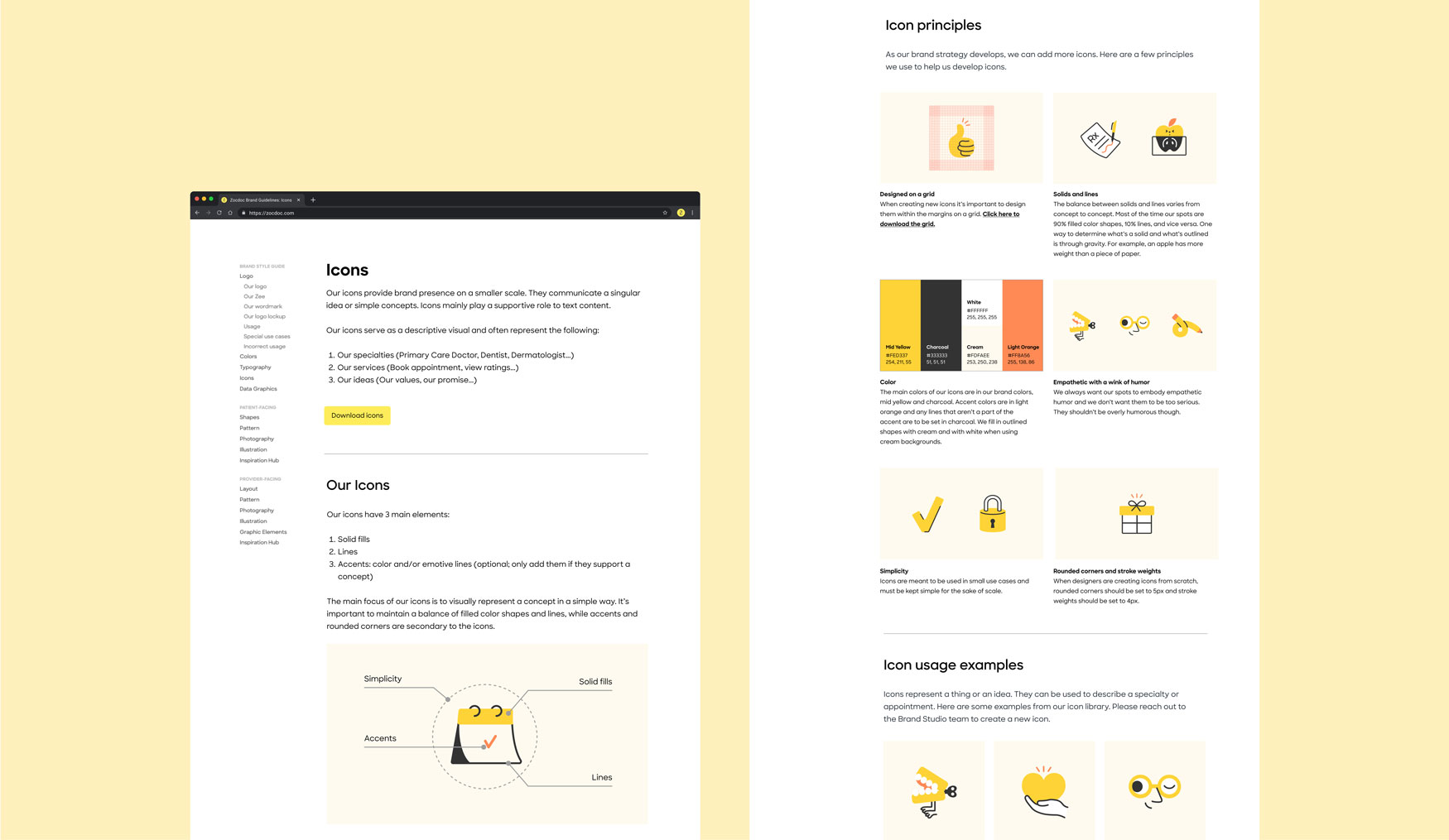
Zocdoc Icon System
Icon design for Zocdoc’s patient brand.

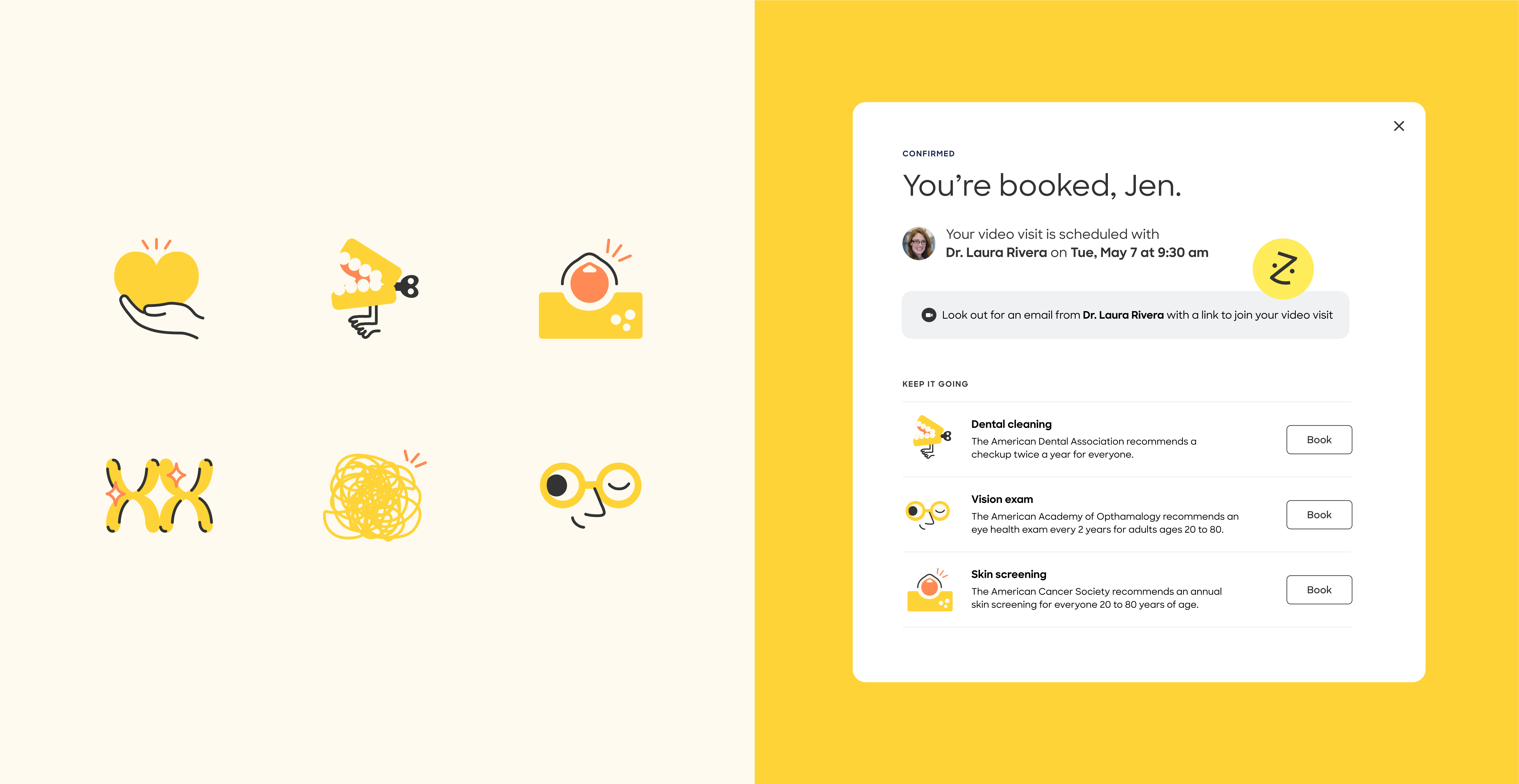
During the patient brand refresh, we noticed that Zocdoc had inconsistent styles and use cases for icons throughout the organization. I took on the task of redesigning Zocdoc's icon system to create a unified and cohesive style. The primary objective of the icons was to represent concepts in a simple manner. Given Zocdoc's frequent use of empathetic humor when addressing sensitive health-related topics, it was crucial to incorporate that style into the icon system. Currently, the icons are being utilized across all brand touchpoints, including social media, the homepage, CRM, and product interfaces.


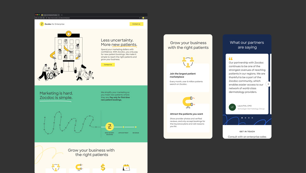
Web landing page design for Zocdoc’s enterprise provider market.

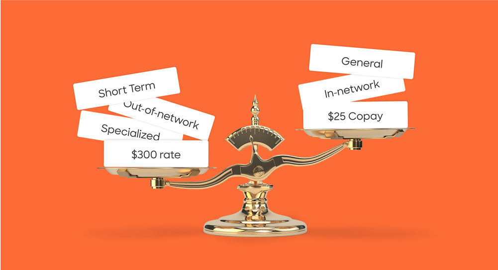
In 2022, I played a key role in the redesign of Zocdoc's enterprise provider join page following the provider brand refresh. My responsibilities involved updating visuals and modernizing the overall design to align with the new provider brand. In collaboration with illustrator Radostina Georgieva, we created a captivating hero graphic that added a fresh visual element to the page. Additionally, I worked closely with Zocdoc's enterprise marketing team to develop an infographic that effectively communicated the message of Zocdoc simplifying marketing for providers. The revamped join page now showcases a cohesive and visually appealing design, highlighting Zocdoc's commitment to streamlining the enterprise provider experience.
Previous landing page
![]()

New landing page
![]()